
Việc tạo logo rất thú vị. Trong bài viết hôm nay, Quantrimang.com sẽ chỉ cho bạn cách tạo không chỉ một, mà là hai biến thể của logo Gmail chỉ bằng CSS3.
Cách tạo logo Gmail 1
Logo đầu tiên này đơn giản và khá dễ tạo. Hãy bắt đầu với việc khởi động trình soạn thảo code yêu thích của bạn và nhập các code HTML sau đây, rồi lưu chúng thành logo-gmail.html.
<html> <head> <title>Gmail CSS Logo</title> <style type='text/css'> </style> </head> <body> <span class='gmail-logo'> <span class='gmail-box'> </span> </span><!-- End .gmail-logo --> </body> </html>Thêm các kiểu CSS sau giữa <style> </style> để reset lại những giá trị CSS mặc định.
.gmail-logo, .gmail-logo *, .gmail-logo *:before, .gmail-logo *:after { margin:0; padding:0; background:transparent; border:0; outline:0; display:block; font:normal normal 0/0 serif; }Những code CSS sau đây sẽ tạo ra logo Gmail màu đỏ nền đỏ và các cạnh được làm tròn.
.gmail-logo { margin:110px auto; background:rgb(201, 44, 25); width:600px; height:400px; border-top:4px solid rgb(201, 44, 25); border-bottom:4px solid rgb(201, 44, 25); border-radius:10px; -moz-border-radius:10px; -webkit-border-radius:10px; }Sau đó, hãy tiến hành tạo hộp trắng trong nền đỏ.
.gmail-logo .gmail-box { overflow:hidden; float:left; width:440px; height:400px; margin:0 0 0 80px; background:white; border-radius:5px; -moz-border-radius:5px; -webkit-border-radius:5px; }Để tạo hiệu ứng "M" màu đỏ, trước tiên bạn hãy tạo một hộp có viền màu đỏ.
.gmail-logo .gmail-box:before { position:relative; content:''; z-index:1; background:white; float:left; width:320px; height:320px; border:100px solid rgb(201, 44, 25); margin:-310px 0 0 -40px; border-radius:10px; -moz-border-radius:10px; -webkit-border-radius:10px; -moz-transform:rotate(45deg); -webkit-transform:rotate(45deg); -o-transform:rotate(45deg); }Sau đó, tiến hành che giấu các cạnh thừa để có một chữ "M" hoàn chỉnh màu đỏ.
.gmail-logo .gmail-box { overflow:hidden; }Bây giờ, thêm hai đường viền màu đỏ mảnh, sao cho logo giống hình chiếc phong bì.
.gmail-logo .gmail-box:after { content:''; float:left; width:360px; height:360px; border:2px solid rgb(201, 44, 25); margin:10px 0 0 40px; -o-transform:rotate(45deg); -webkit-transform:rotate(45deg); -moz-transform:rotate(45deg); }Mọi thao tác đã gần hoàn tất. Chỉ cầm thêm một số gradient cho hình phong bì màu đỏ này nữa mà thôi.
.gmail-logo:after { content:''; position:relative; z-index:2; content:''; float:left; margin-top:-404px; width:600px; height:408px; display:block; background: -moz-linear-gradient(top, rgba(255, 255, 255, 0.3) 0%, /* rgba(255, 255, 255, 0.3) 30%, */ rgba(255, 255, 255, 0.1) 100%); background:-o-linear-gradient(top, rgba(255, 255, 255, 0.3) 0%, /* rgba(255, 255, 255, 0.2) 30%, */ rgba(255, 255, 255, 0.1) 100%); background:-webkit-gradient( linear, left top, left bottom, color-stop(0%, rgba(255, 255, 255, 0.3)), /* color-stop(30%, rgba(255, 255, 255, 0.2)), */ color-stop(100%, rgba(255, 255, 255, 0.1))); }Cuối cùng nhưng không kém phần quan trọng, hãy cho logo một màu khác khi di chuột qua. Thêm HTML DOCTYPE sau đây trước <html>.
<!DOCTYPE HTML PUBLIC "-//W3C//DTD XHTML 1.0 Strict//EN" "http://www.w3.org/TR/xhtml1/DTD/xhtml1-strict.dtd"> Và các kiểu CSS sau trước </style>.
.gmail-logo:hover { background:#313131; border-color:#313131; /* cursor:pointer; */ } .gmail-logo:hover .gmail-box:before { border-color:#313131; } .gmail-logo:hover .gmail-box:after { border-color:#313131; border-bottom-color:#fff; border-right-color:#fff; }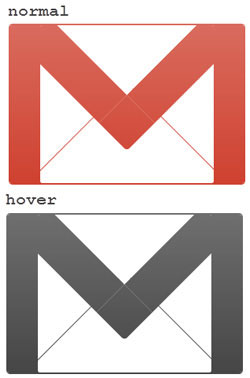
Cách tạo logo Gmail 2
Tiếp theo, bài viết sẽ tạo logo Gmail từ một góc nhìn khác với hiệu ứng 3D nhỏ. Ví dụ sẽ bắt đầu với HTML markup cơ bản.
<html> <head> <title>Gmail logo 2 </title> <style type="text/css"> </style> </head> <body> <span id='gmail-logo2'> <span class='element1'> </span> <span class='element2'> </span> <span class='element3'> </span> <span class='element4'> </span> <span class='element5'> </span> </span> </body> </html>Vì logo có một phối cảnh khác, nên ta sẽ bắt đầu bằng cách xoay nó một chút và tạo các layer cần thiết (gọi là các phần tử) theo trình tự.
#gmail-logo2 { margin:0 auto; display:block; width:380px; height:290px; -moz-transform:rotate(6deg); -webkit-transform:rotate(6deg); -o-transform:rotate(6deg); transform:rotate(6deg); } #gmail-logo2 .element1 { display:block; width:380px; height:290px; } #gmail-logo2 .element2, #gmail-logo2 .element3, #gmail-logo2 .element4, #gmail-logo2 .element5 { float:left; display:block; width:380px; height:290px; margin:-290px 0 0 0; }Định kiểu cho .element1::before
#gmail-logo2 .element1::before { content:''; position:relative; margin:2px 0 0 14px; float:left; display:block; background:rgb(201, 44, 25); width:30px; height:276px; -moz-transform:rotate(3deg); -webkit-transform:rotate(3deg); -o-transform:rotate(3deg); transform:rotate(3deg); border-radius:22px 0 0 20px; -moz-border-radius:22px 0 0 20px; -webkit-border-radius:22px 0 0 20px; box-shadow: -1px 1px 0 rgb(109, 10, 0), -2px 2px 0 rgb(109, 10, 0), -3px 3px 0 rgb(109, 10, 0), -4px 4px 0 rgb(109, 10, 0), -5px 5px 0 rgb(109, 10, 0), -6px 6px 0 rgb(109, 10, 0); -webkit-box-shadow: -1px 1px 0 rgb(109, 10, 0), -2px 2px 0 rgb(109, 10, 0), -3px 3px 0 rgb(109, 10, 0), -4px 4px 0 rgb(109, 10, 0), -5px 5px 0 rgb(109, 10, 0), -6px 6px 0 rgb(109, 10, 0); -moz-box-shadow: -1px 1px 0 rgb(109, 10, 0), -2px 2px 0 rgb(109, 10, 0), -3px 3px 0 rgb(109, 10, 0), -4px 4px 0 rgb(109, 10, 0), -5px 5px 0 rgb(109, 10, 0), -6px 6px 0 rgb(109, 10, 0); } Định kiểu cho .element1::after
#gmail-logo2 .element1::after { content:''; position:relative; margin:40px 5px 0 0; float:right; display:block; background:rgb(201, 44, 25); width:30px; height:238px; -moz-transform:rotate(3deg); -webkit-transform:rotate(3deg); -o-transform:rotate(3deg); transform:rotate(3deg); border-radius:0 18px 26px 0; -webkit-border-radius:0 18px 26px 0; -moz-border-radius:0 18px 26px 0; box-shadow: -1px 1px 0 rgb(109, 10, 0), -2px 2px 0 rgb(109, 10, 0), -3px 3px 0 rgb(109, 10, 0), -4px 4px 0 rgb(109, 10, 0), -5px 5px 0 rgb(109, 10, 0), -6px 6px 0 rgb(109, 10, 0), -6px 7px 0 rgb(109, 10, 0); -moz-box-shadow: -1px 1px 0 rgb(109, 10, 0), -2px 2px 0 rgb(109, 10, 0), -3px 3px 0 rgb(109, 10, 0), -4px 4px 0 rgb(109, 10, 0), -5px 5px 0 rgb(109, 10, 0), -6px 6px 0 rgb(109, 10, 0), -6px 7px 0 rgb(109, 10, 0); -webkit-box-shadow: -1px 1px 0 rgb(109, 10, 0), -2px 2px 0 rgb(109, 10, 0), -3px 3px 0 rgb(109, 10, 0), -4px 4px 0 rgb(109, 10, 0), -5px 5px 0 rgb(109, 10, 0), -6px 6px 0 rgb(109, 10, 0), -6px 7px 0 rgb(109, 10, 0); }Định kiểu cho .element2::before
#gmail-logo2 .element2::before { content:''; margin:22px 0 0 48px; float:left; display:block; background:rgb(201, 44, 25); width:315px; height:14px; -moz-transform:rotate(6.8deg); -webkit-transform:rotate(6.8deg); -o-transform:rotate(6.8deg); transform:rotate(6.8deg); box-shadow: 0 1px 0 rgb(109, 10, 0), 0 2px 0 rgb(109, 10, 0), 0 3px 0 rgb(109, 10, 0), 0 4px 0 rgb(109, 10, 0), 0 5px 0 rgb(109, 10, 0), -6px 6px 0 rgb(109, 10, 0); -webkit-box-shadow: 0 1px 0 rgb(109, 10, 0), 0 2px 0 rgb(109, 10, 0), 0 3px 0 rgb(109, 10, 0), 0 4px 0 rgb(109, 10, 0), 0 5px 0 rgb(109, 10, 0), -6px 6px 0 rgb(109, 10, 0); -moz-box-shadow: 0 1px 0 rgb(109, 10, 0), 0 2px 0 rgb(109, 10, 0), 0 3px 0 rgb(109, 10, 0), 0 4px 0 rgb(109, 10, 0), 0 5px 0 rgb(109, 10, 0), -6px 6px 0 rgb(109, 10, 0); }Định kiểu cho .element2::after
#gmail-logo2 .element2::after { content:''; position:relative; margin:230px 0 0 36px; float:left; display:block; background:rgb(201, 44, 25); width:310px; height:12px; box-shadow: 0 1px 0 rgb(109, 10, 0), 0 2px 0 rgb(109, 10, 0), 0 3px 0 rgb(109, 10, 0), 0 4px 0 rgb(109, 10, 0), 0 5px 0 rgb(109, 10, 0), -6px 6px 0 rgb(109, 10, 0); -webkit-box-shadow: 0 1px 0 rgb(109, 10, 0), 0 2px 0 rgb(109, 10, 0), 0 3px 0 rgb(109, 10, 0), 0 4px 0 rgb(109, 10, 0), 0 5px 0 rgb(109, 10, 0), -6px 6px 0 rgb(109, 10, 0); -moz-box-shadow: 0 1px 0 rgb(109, 10, 0), 0 2px 0 rgb(109, 10, 0), 0 3px 0 rgb(109, 10, 0), 0 4px 0 rgb(109, 10, 0), 0 5px 0 rgb(109, 10, 0), -6px 6px 0 rgb(109, 10, 0); }Định kiểu cho .element3::before
#gmail-logo2 .element3::before { content:''; position:relative; margin:8px 0 0 42px; float:left; display:block; background:rgb(201, 44, 25); width:42px; height:268px; -moz-transform:rotate(3deg); -webkit-transform:rotate(3deg); -o-transform:rotate(3deg); transform:rotate(3deg); }Định kiểu cho .element3::after
#gmail-logo2 .element3::after { content:''; position:relative; margin:40px 32px 0 0; float:right; display:block; background:rgb(201, 44, 25); width:22px; height:236px; -moz-transform:rotate(3.0deg); -webkit-transform:rotate(3.0deg); -o-transform:rotate(3.0deg); transform:rotate(3.0deg); box-shadow: 0 1px 0 rgb(109, 10, 0), 0 2px 0 rgb(109, 10, 0), 0 3px 0 rgb(109, 10, 0), 0 4px 0 rgb(109, 10, 0), 0 5px 0 rgb(109, 10, 0), -6px 6px 0 rgb(109, 10, 0); -webkit-box-shadow: 0 1px 0 rgb(109, 10, 0), 0 2px 0 rgb(109, 10, 0), 0 3px 0 rgb(109, 10, 0), 0 4px 0 rgb(109, 10, 0), 0 5px 0 rgb(109, 10, 0), -6px 6px 0 rgb(109, 10, 0); -moz-box-shadow: 0 1px 0 rgb(109, 10, 0), 0 2px 0 rgb(109, 10, 0), 0 3px 0 rgb(109, 10, 0), 0 4px 0 rgb(109, 10, 0), 0 5px 0 rgb(109, 10, 0), -6px 6px 0 rgb(109, 10, 0); } Định kiểu cho .element4::before
#gmail-logo2 .element4::before { content:''; position:relative; margin:-2px 0 0 130px; float:left; display:block; background:rgb(201, 44, 25); width:54px; height:192px; -moz-transform:rotate(-49deg); -webkit-transform:rotate(-49deg); -o-transform:rotate(-49deg); transform:rotate(-49deg); box-shadow: -1px 0 0 rgb(109, 10, 0), -2px 0 0 rgb(109, 10, 0), -3px 0 0 rgb(109, 10, 0), -4px 0 0 rgb(109, 10, 0), -5px 0 0 rgb(109, 10, 0), -6px 0 0 rgb(109, 10, 0), -7px 0 0 rgb(109, 10, 0), -8px 0 0 rgb(109, 10, 0); -moz-box-shadow: -1px 0 0 rgb(109, 10, 0), -2px 0 0 rgb(109, 10, 0), -3px 0 0 rgb(109, 10, 0), -4px 0 0 rgb(109, 10, 0), -5px 0 0 rgb(109, 10, 0), -6px 0 0 rgb(109, 10, 0), -7px 0 0 rgb(109, 10, 0), -8px 0 0 rgb(109, 10, 0); -webkit-box-shadow: -1px 0 0 rgb(109, 10, 0), -2px 0 0 rgb(109, 10, 0), -3px 0 0 rgb(109, 10, 0), -4px 0 0 rgb(109, 10, 0), -5px 0 0 rgb(109, 10, 0), -6px 0 0 rgb(109, 10, 0), -7px 0 0 rgb(109, 10, 0), -8px 0 0 rgb(109, 10, 0); }Định kiểu cho .element4::after
#gmail-logo2 .element4::after { content:''; position:relative; margin:12px 88px 0 0; float:right; display:block; background:rgb(201, 44, 25); width:54px; height:186px; border-radius:30px 0 0 0; -webkit-border-radius:30px 0 0 0; -moz-border-radius:30px 0 0 0; -moz-transform:rotate(53deg); -webkit-transform:rotate(53deg); -o-transform:rotate(53deg); transform:rotate(53deg); }Định kiểu cho .element5::before
#gmail-logo2 .element5::before { content:''; position:relative; margin:115px 0 0 125px; float:left; display:block; background:rgb(201, 44, 25); width:2px; height:150px; -moz-transform:rotate(55deg); -o-transform:rotate(55deg); -webkit-transform:rotate(55deg); transform:rotate(55deg); }Định kiểu cho .element5::after
#gmail-logo2 .element5::after { position:relative; content:''; margin:115px 0 0 150px; float:left; display:block; background:rgb(201, 44, 25); width:2px; height:150px; -moz-transform:rotate(-50deg); -webkit-transform:rotate(-50deg); -o-transform:rotate(-50deg); transform:rotate(-50deg); }Điều chỉnh mức độ ưu tiên của z-index.
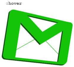
#gmail-logo2 .element1::before {z-index:3;} #gmail-logo2 .element1::after {z-index:1;} /*#gmail-logo2 .element2::before {}*/ #gmail-logo2 .element2::after {z-index:2;} #gmail-logo2 .element3::before {z-index:5;} #gmail-logo2 .element3::after {z-index:1;} #gmail-logo2 .element4::before {z-index:4;} #gmail-logo2 .element4::after {z-index:3;} /*#gmail-logo2 .element5::before {} #gmail-logo2 .element5::after {}*/Mọi thứ đã gần hoàn tất. Logo Gmail của bạn sẽ trông giống như thế này:
Cuối cùng, hãy để cho logo một màu khác khi di chuột.
#gmail-logo2:hover *::after, #gmail-logo2:hover *::before { background:rgba(20, 196, 7, 1); } #gmail-logo2:hover .element1::before { box-shadow: -1px 1px 0 rgb(10, 90, 4), -2px 2px 0 rgb(10, 90, 4), -3px 3px 0 rgb(10, 90, 4), -4px 4px 0 rgb(10, 90, 4), -5px 5px 0 rgb(10, 90, 4), -6px 6px 0 rgb(10, 90, 4); -webkit-box-shadow: -1px 1px 0 rgb(10, 90, 4), -2px 2px 0 rgb(10, 90, 4), -3px 3px 0 rgb(10, 90, 4), -4px 4px 0 rgb(10, 90, 4), -5px 5px 0 rgb(10, 90, 4), -6px 6px 0 rgb(10, 90, 4); -moz-box-shadow: -1px 1px 0 rgb(10, 90, 4), -2px 2px 0 rgb(10, 90, 4), -3px 3px 0 rgb(10, 90, 4), -4px 4px 0 rgb(10, 90, 4), -5px 5px 0 rgb(10, 90, 4), -6px 6px 0 rgb(10, 90, 4); } #gmail-logo2:hover .element1::after { box-shadow: -1px 1px 0 rgb(10, 90, 4), -2px 2px 0 rgb(10, 90, 4), -3px 3px 0 rgb(10, 90, 4), -4px 4px 0 rgb(10, 90, 4), -5px 5px 0 rgb(10, 90, 4), -6px 6px 0 rgb(10, 90, 4), -6px 7px 0 rgb(10, 90, 4); -moz-box-shadow: -1px 1px 0 rgb(10, 90, 4), -2px 2px 0 rgb(10, 90, 4), -3px 3px 0 rgb(10, 90, 4), -4px 4px 0 rgb(10, 90, 4), -5px 5px 0 rgb(10, 90, 4), -6px 6px 0 rgb(10, 90, 4), -6px 7px 0 rgb(10, 90, 4); -webkit-box-shadow: -1px 1px 0 rgb(10, 90, 4), -2px 2px 0 rgb(10, 90, 4), -3px 3px 0 rgb(10, 90, 4), -4px 4px 0 rgb(10, 90, 4), -5px 5px 0 rgb(10, 90, 4), -6px 6px 0 rgb(10, 90, 4), -6px 7px 0 rgb(10, 90, 4); } #gmail-logo2:hover .element2::before { box-shadow: 0 1px 0 rgb(10, 90, 4), 0 2px 0 rgb(10, 90, 4), 0 3px 0 rgb(10, 90, 4), 0 4px 0 rgb(10, 90, 4), 0 5px 0 rgb(10, 90, 4), -6px 6px 0 rgb(10, 90, 4); -webkit-box-shadow: 0 1px 0 rgb(10, 90, 4), 0 2px 0 rgb(10, 90, 4), 0 3px 0 rgb(10, 90, 4), 0 4px 0 rgb(10, 90, 4), 0 5px 0 rgb(10, 90, 4), -6px 6px 0 rgb(10, 90, 4); -moz-box-shadow: 0 1px 0 rgb(10, 90, 4), 0 2px 0 rgb(10, 90, 4), 0 3px 0 rgb(10, 90, 4), 0 4px 0 rgb(10, 90, 4), 0 5px 0 rgb(10, 90, 4), -6px 6px 0 rgb(10, 90, 4); } #gmail-logo2:hover .element2::after { box-shadow: 0 1px 0 rgb(10, 90, 4), 0 2px 0 rgb(10, 90, 4), 0 3px 0 rgb(10, 90, 4), 0 4px 0 rgb(10, 90, 4), 0 5px 0 rgb(10, 90, 4), -6px 6px 0 rgb(10, 90, 4); -webkit-box-shadow: 0 1px 0 rgb(10, 90, 4), 0 2px 0 rgb(10, 90, 4), 0 3px 0 rgb(10, 90, 4), 0 4px 0 rgb(10, 90, 4), 0 5px 0 rgb(10, 90, 4), -6px 6px 0 rgb(10, 90, 4); -moz-box-shadow: 0 1px 0 rgb(10, 90, 4), 0 2px 0 rgb(10, 90, 4), 0 3px 0 rgb(10, 90, 4), 0 4px 0 rgb(10, 90, 4), 0 5px 0 rgb(10, 90, 4), -6px 6px 0 rgb(10, 90, 4); } #gmail-logo2:hover .element3::after { box-shadow: 0 1px 0 rgb(10, 90, 4), 0 2px 0 rgb(10, 90, 4), 0 3px 0 rgb(10, 90, 4), 0 4px 0 rgb(10, 90, 4), 0 5px 0 rgb(10, 90, 4), -6px 6px 0 rgb(10, 90, 4); -webkit-box-shadow: 0 1px 0 rgb(10, 90, 4), 0 2px 0 rgb(10, 90, 4), 0 3px 0 rgb(10, 90, 4), 0 4px 0 rgb(10, 90, 4), 0 5px 0 rgb(10, 90, 4), -6px 6px 0 rgb(10, 90, 4); -moz-box-shadow: 0 1px 0 rgb(10, 90, 4), 0 2px 0 rgb(10, 90, 4), 0 3px 0 rgb(10, 90, 4), 0 4px 0 rgb(10, 90, 4), 0 5px 0 rgb(10, 90, 4), -6px 6px 0 rgb(10, 90, 4); } #gmail-logo2:hover .element4::before { box-shadow: -1px 0 0 rgb(10, 90, 4), -2px 0 0 rgb(10, 90, 4), -3px 0 0 rgb(10, 90, 4), -4px 0 0 rgb(10, 90, 4), -5px 0 0 rgb(10, 90, 4), -6px 0 0 rgb(10, 90, 4), -7px 0 0 rgb(10, 90, 4), -8px 0 0 rgb(10, 90, 4); -moz-box-shadow: -1px 0 0 rgb(10, 90, 4), -2px 0 0 rgb(10, 90, 4), -3px 0 0 rgb(10, 90, 4), -4px 0 0 rgb(10, 90, 4), -5px 0 0 rgb(10, 90, 4), -6px 0 0 rgb(10, 90, 4), -7px 0 0 rgb(10, 90, 4), -8px 0 0 rgb(10, 90, 4); -webkit-box-shadow: -1px 0 0 rgb(10, 90, 4), -2px 0 0 rgb(10, 90, 4), -3px 0 0 rgb(10, 90, 4), -4px 0 0 rgb(10, 90, 4), -5px 0 0 rgb(10, 90, 4), -6px 0 0 rgb(10, 90, 4), -7px 0 0 rgb(10, 90, 4), -8px 0 0 rgb(10, 90, 4); }


